


Last week we received an email from one of our customers: “Can I put sparklines on our accounts in Salesforce? It would be amazing to see usage growth over the past six weeks visually.” I agreed that would be amazing, but I was doubtful. Maybe a fancy AppExchange app could help, but out of the box, images aren’t a Salesforce field types so I thought they were out of luck.
But with a little digging, we discovered a hidden little Salesforce feature: Formula fields have an Image function. And then this happened:
Now our customer has a live sparkline showing the real-time growth of every customer right on their Salesforce Account record. Today I’m going to show you how to set that up for yourself!
Get the data into Salesforce
The first step is to get the data points that will power your sparkline into Salesforce. We do this in our sleep at Census (literally, you can schedule your syncs to run at any hour of the day, or even continuously), so I’ll walk through how to do that with Census though you could also use the Salesforce API or any other method to update the field.
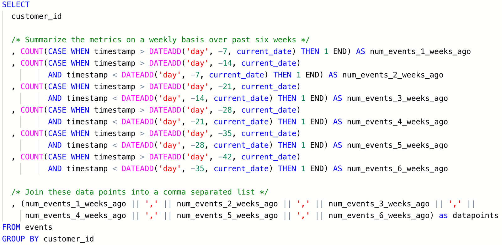
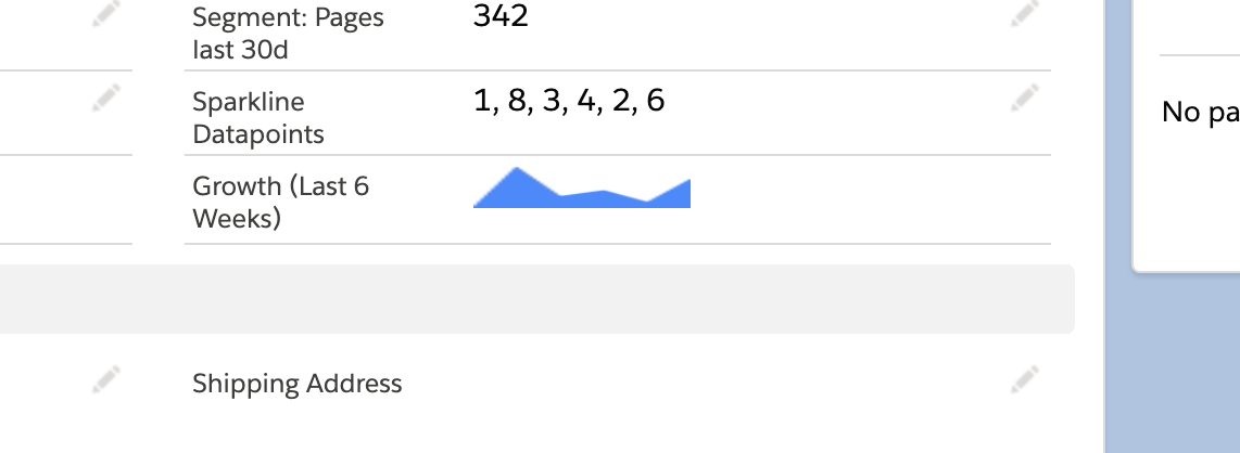
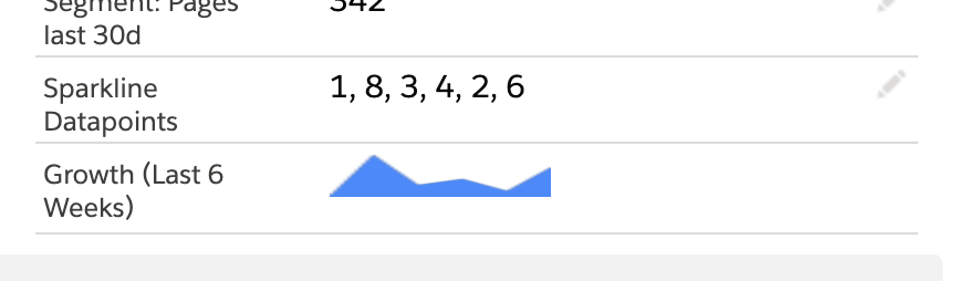
Here I’m calculating the datapoints over the last six weeks and then I join them into a comma separated list. That’s the value we’re going push into Salesforce that we’ll use for our sparkline, you’ll see why it’s a comma separated list in a minute. My last step is to take this new datapoint and push it into a text field in Salesforce.
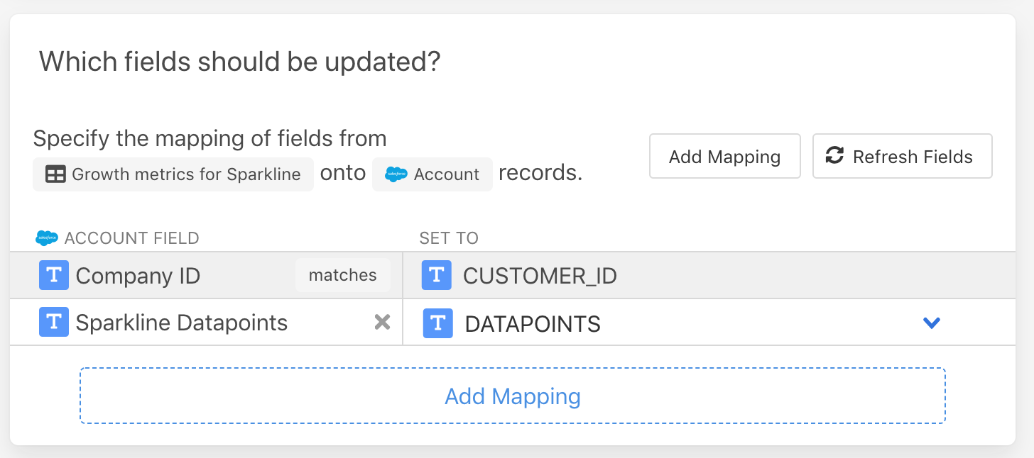

The datapoints field is currently visible on my Salesforce Account records so that I can verify data is being synced correctly, but it’s just going to be powering the graph in a moment so you could also hide it from your page layout once you’re done.
Graphing the data
We’ve got our datapoints in Salesforce and Census is happily keeping them up to date. How do we show that as a sparkline? We’re going to use that image function I mentioned and a great service called QuickChart.
You can think of Quickchart as an API for creating graphs. You provide datapoints in a URL and it instantly renders the graph and returns the image. They happen to have a pre-built Sparkline style, which we’ll use with our datapoints field.In Salesforce, I create a new field on my Account called Growth (Last 6 Weeks), and make it a Formula type. The formula is the magic that ties it all together:
- Uses the Image function
- To make a call to the QuickChart API service
- And passes the comma separated data points in the field that Census is populating
IMAGE(
  'https://quickchart.io/chart?bkg=white&c={ type: "sparkline", data: { datasets: [{ data: [' + Sparkline_Datapoints__c + '] }] }}', 'Account Growth Sparkline', 20, 100)
You can see we use the comma separated list from the Sparkline_Datapoints__c field and then create a URL that includes that value and passes it to QuickChart. And here’s the result. If you modify the data in the datapoints field, Salesforce will send those values to QuickChart and they’ll update the graph instantly. Boom! Live sparklines, directly inside Salesforce. No AppExchange app necessary.
Just another super power for Census customers. And if you need a hand getting your live data into Salesforce, contact us and we will show you how easy it can be!