Normally, we reserve our blog space for nerding out about all things data. But we’re feeling pretty geeked about our new rebrand, and wanted to let y'all in on how the magical relaunch came to be.
If you’re reading this article (and have been on our social channels this week), you’ve probably noticed that we’ve changed a few things for the better. 🌟
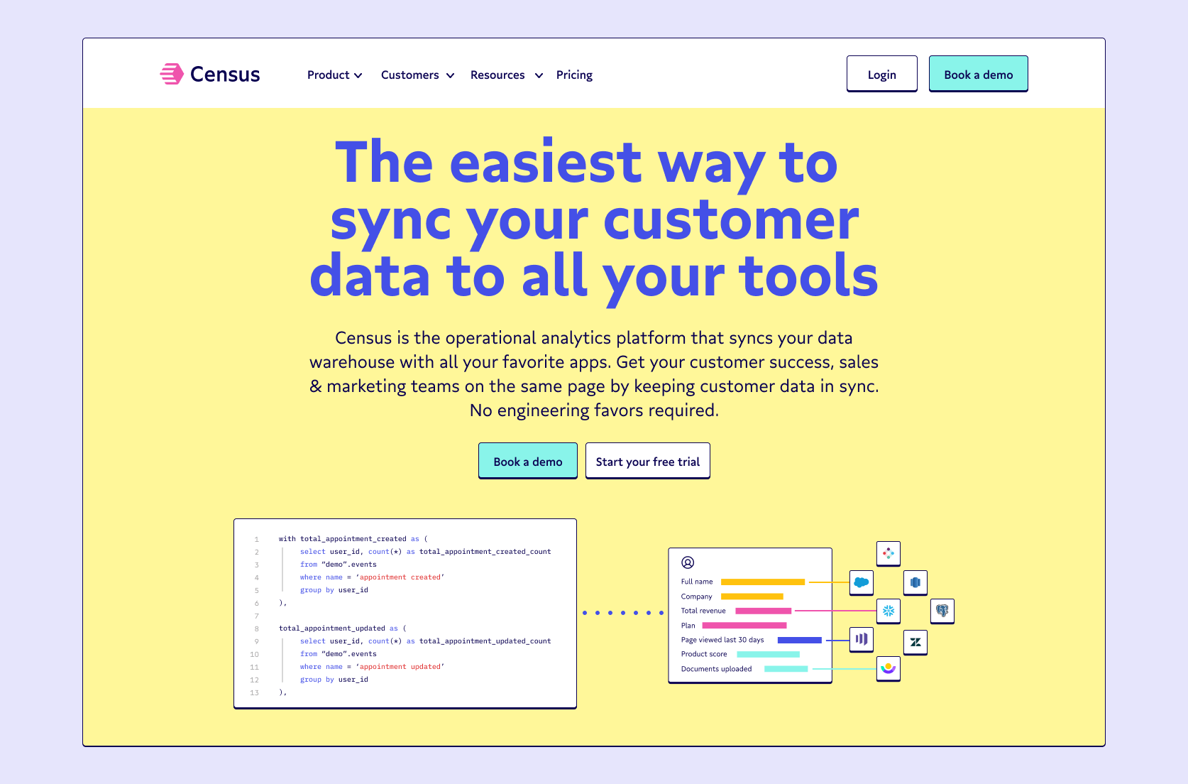
New colors, new fonts, new logo (oh my!) — this is our coming-of-age story, unfolding in real-time for the data community to see. We knew that in an industry as rapidly evolving as ours, the worst thing we could do was play it safe and stick with branding that we've outgrown. We wanted our identity to reflect our enthusiasm for empowering the best and brightest teams and people with new tools and frameworks.
Staying true to our roots
Census has a strong history of being bold, expressive, and opinionated from the founding team down. We wanted our brand identity to reflect this from the re-start.
Over the last few months, our team worked to find our internal ethos (think Myers-Briggs or Enneagram personality tests but for your brand). We decided to center on archetypes of Creator (expressive, imaginative, and innovative) and Sage (clear, open-minded, and driven by experiment). These two archetypes are informed by Carl Jung and Joseph Campbell and further translated into brand contexts by Margaret Mark and Carol Pearson in their book The Hero and the Outlaw if you want a deep dive into brand identity.
TL;DR: When brainstorming our new brand, we wanted to emphasize the trust our product has built in the community as an integral part of the modern data stack, without feeling too enterprise-y.
The delight is in the logo details
We’re all sticklers for details here at Census, whether it’s in the domain of data or design.
We knew that each detail of our new brand needed to precisely communicate the energy and narrative of our emerging reverse ETL and operational analytics space.
You’re probably familiar (we hope) with our old visual identity, which used a Google Font called Lato in a single yellow. We used it in our previous logo and broke off the C for a monogram when we needed a shortened version. It wasn’t exactly low-impact, but it didn't really tell you anything.
We wanted a 2.0 logo that pointed back to our position as leaders in operational analytics and made an impression. So we scrapped our old logo concept and started carte blanche.
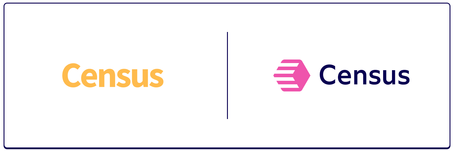
We’re in an exciting, rapidly expanding new space. Our new logo had to be straightforward, enjoyable, and simple (aka something you wanted to see when browsing the Locally Optimistic or dbt Slack spaces 👋 ).
Riding the Vaporwave
From the onset, we knew we wanted colors that were outspoken, reflecting our brand strategy and attributes. Accessibility and contrast were also tremendous drivers in our decisions on background colors and the colors we set for typography.
Without sounding too lofty, we took inspiration from the saturation of Vaporwave (you probably know it from electronic music and visual art styles in a lot of modern design) and blended it with the practicality of the color contrast of the Bauhaus movement (a German art and culture style of the 1920–30s).
The result is a vibrant and functional palette of sweet and savory colors for all of our brand communications. (And it gave us an excuse to pepper the 🦩 emoji throughout our company Slack).

Setting the tone with typography
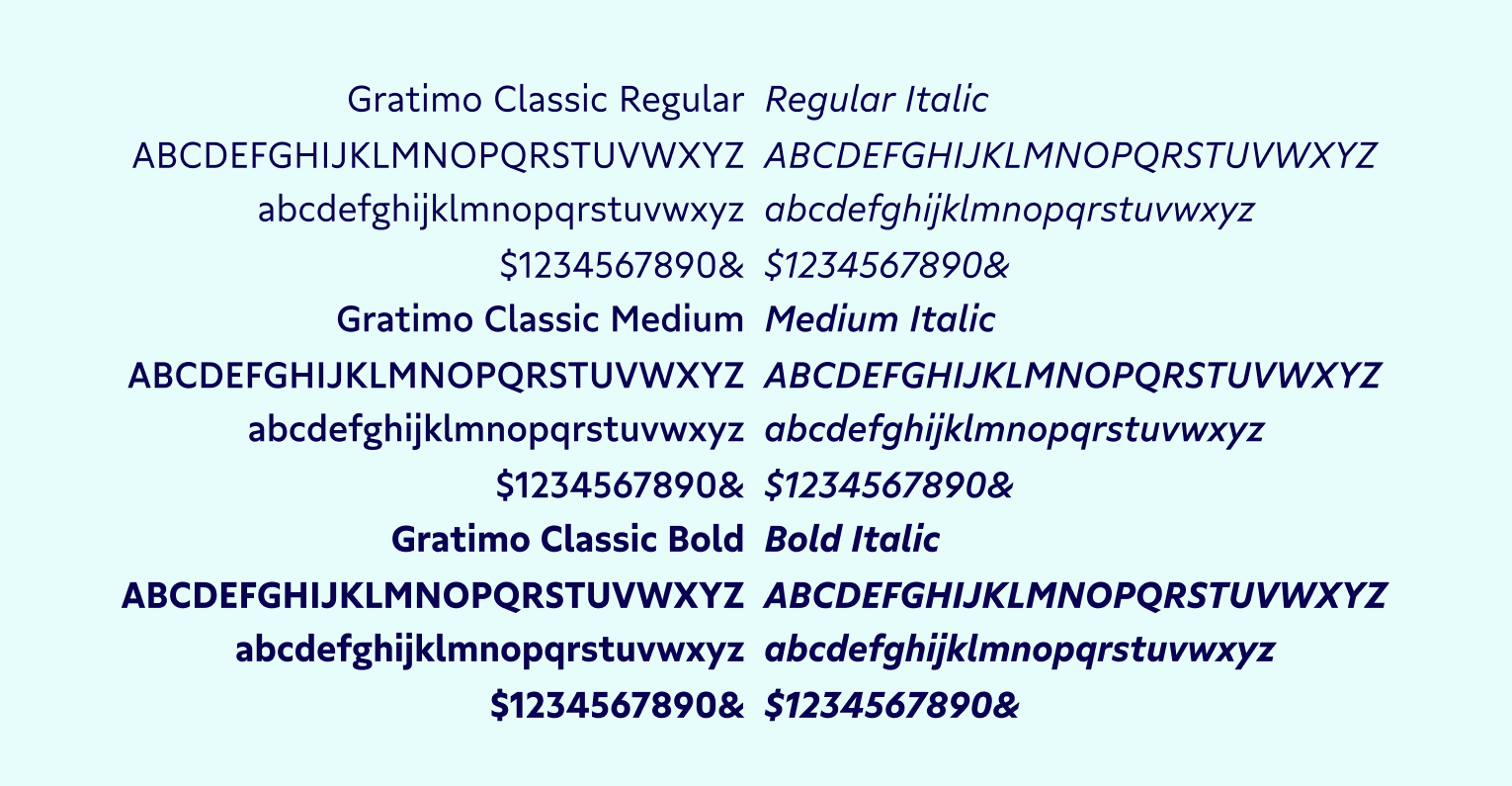
Our brand typography is set exclusively in Gratimo Classic, a font family designed by TypeMates. Gratimo Classic is professionally geometric (near perfectly circular «o») and personally humanist in its construction and feel (which means it loosely follows calligraphic hand lettering). Letterforms are drawn from simple, elemental standards while having a unique and identifiable visual tone.
The weights are clean and easy to maneuver—easily combining for the headline, subhead, and small text settings. This font was a great match for the simplicity and cleanliness we set out to design with our rebooted logo.
Working with TypeMates, we customized the lowercase «g» to change the entire texture of the font. This small tweak more perfectly aligned the font with our DNA as a data-driven, trustworthy brand while still coming across bold and expressive. The sans serif is a classic, familiar favorite, but still unique and identifiable.
Defining a new era of Census
In a surprise to absolutely no one on our team: The logo was the most difficult element to design.
As the saying goes, you can only make a first impression once. We wanted to make sure that our logo wasn't just a flag of brand recognition for folks, but a doorway into a more complete brand experience and ongoing partnership with our team.
We’ve worked hard over the last few years to define a new category of the data space, and we wanted our new logo to represent a fresh start that built on this innovative reputation, free of existing visual tropes and identifiers. (You'll notice, we've deliberately steered clear of the conventional blue of tech startups and gradients everywhere.)
Originally, we played around with data stacks, abstraction of warehouses and transportation, and excessive line work (trying to communicate motion and movement). But we ultimately decided on the shiny new logo you see below, which loosely references the hexagon of data warehouse icons (turned on its side) and features stripes of movement to show data en route and efficiency in motion.
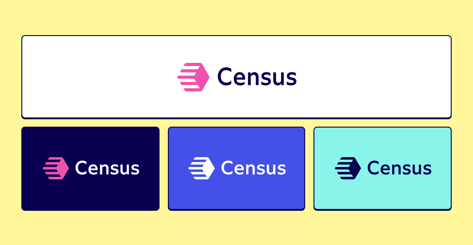
This is the new symbol of operational analytics and a new era of the modern data stack. 🚀
Uniting behind a new age for the Census brand (and the data community)
Redefining a brand that so many folks are close to is never easy, but we're tremendously excited about the end result. This new set of colors, typography, and logo tie together our visual identity to give us a recognizable and memorable brand that will continue to evolve in the data community.
And, of course, we’ve updated our website. 😍 And, to the delight of our team members and champions, the rebranding has brought with it a round of new swag and a fancy new neon sign for the SF office.
This is only the beginning of our world takeover. 💪 Check it all out in action at over on our main site, getcensus.com.
