


If you’re new to Snowflake or you're using the classic web console to run SQL queries on Snowflake data... Welcome!
You’re in for a sweet ride, so hop on – we'll show you around! 🚲
Snowsight is a remarkably quick and intuitive second-generation Snowflake web interface that can be used by all accounts running on Amazon Web Services (AWS), Microsoft Azure, and the Google Cloud Platform. Of course, you can use Snowsight to run queries and manage your Snowflake data cloud, but you can also do so much more.
In Snowsight, you can create, modify, and manage users, databases, and database objects, share data with other Snowflake accounts and navigate the Snowflake Data Marketplace all in one streamlined interface.
Unlike traditional business intelligence tools like Tableau, Qlik, or Power BI which are more geared towards business users and corporate reporting needs, Snowsight uses fast querying, SQL auto-completion, automatic stats, and various charts for data visualization. What does that mean for users? Basically, you can complete ad-hoc data analysis on massive datasets in a jiffy.
In this tutorial, you’ll learn how to get started with Snowsight by creating a worksheet, running a query, analyzing the results, and summarizing the results with automatically generated contextual statistics. To explore the interface, we’ll take Snowflake’s Citi Bike sample data for a spin.
Get ready to ride 🚴
Picture this: the year is 2018 and you’re a member of Lyft’s marketing team. Lyft has just acquired the popular New York City bike-sharing platform, Citi Bike, and you’re interested in looking at some of their data for future marketing campaign strategizing purposes.
Unfortunately, you find that Citi Bike tracks information about every, single ride (including where it was unlocked, how long the ride was, and where it was docked) as well as some demographic and subscription information, giving you tons of data to wade through.
With 8 million data points in 2018 alone, a typical analysis with this volume of data would be painful (not to mention cumbersome), but with Snowsight in Snowflake you can quickly and painlessly extract the information you need.
Running SQL queries with a Snowsight worksheet
Snowsight is the user interface/user experience (UI/UX) replacement for the Classic Console in Snowflake and comes equipped with many unique, out-of-the-box query improvements.
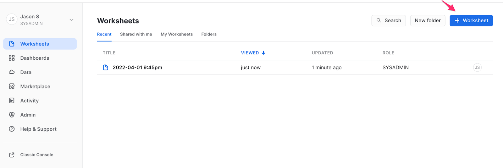
When you first log in to your Snowflake instance you can either import your old worksheets (if you previously used the Classic Console), or create a new worksheet. For this example, we'll start by creating a new worksheet, renaming this worksheet “CITIBIKE”, and connecting it to the Citi Bike database that we have previously loaded with Citi Bike “trips data."
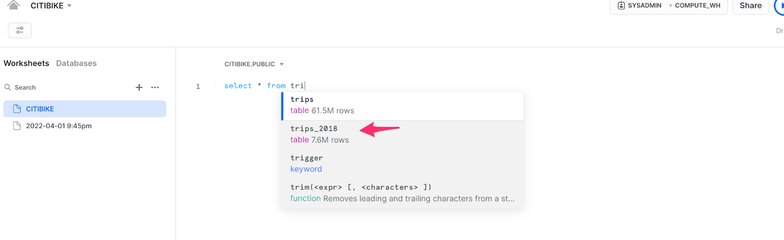
If you start typing a query, you’ll notice the first improvement of Snowsight is the SQL “auto-complete”, which helps complete the query for you to minimize mistakes. You can see here that typing “tri” after “select *” brings up some of the existing tables and even shows how many rows are in each table. For this example, we will query “trips_2018."
Quick result summaries in the contextual statistics pane
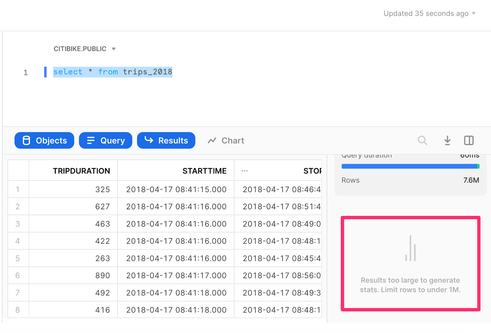
After running the query, there will be several outputs. You’ll see a “results” section that shows the data in tabular form and, to the right of the query results, there will also be an area for Contextual Statistics. Snowflake automatically calculates these statistics and produces simple visualizations to help you make sense of your data at a glance. 🙌
Contextual statistics are generated automatically for queries that result in 100k or fewer rows; however, in this case, the query result was too large.
We’ll now re-run the query setting a limit of 999,999. Since this is just 1/8 of the data and we’re most interested in trips with the longest duration, we’ll sort by trip duration.
The statistics will take a little while to generate, but you’ll notice some interesting trends. For instance, of the ~1M longest trips, only 3 stations were the end destination for more than 1% of those trips, with the Central Park South & 6 Avenue stations being the most popular end station.
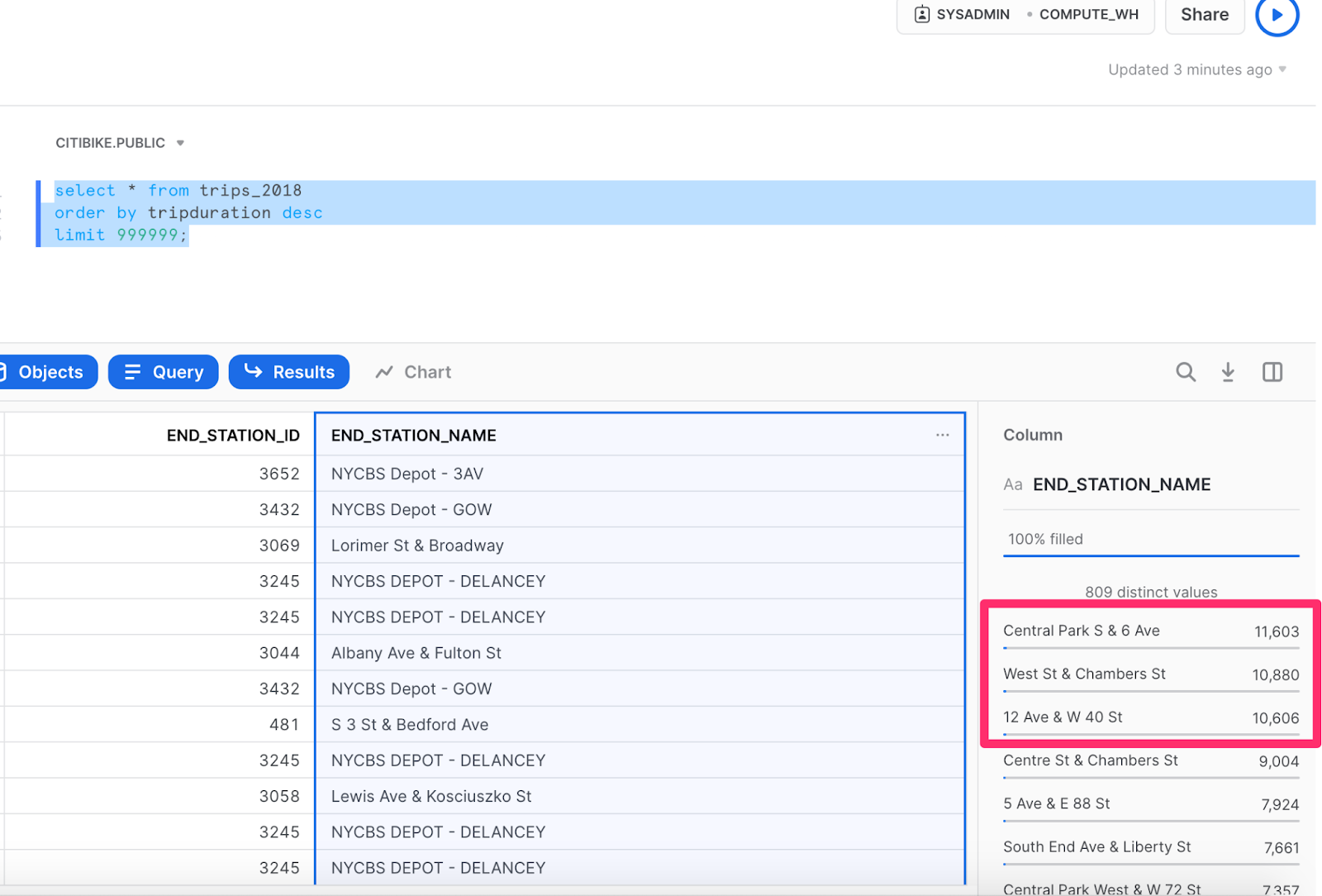
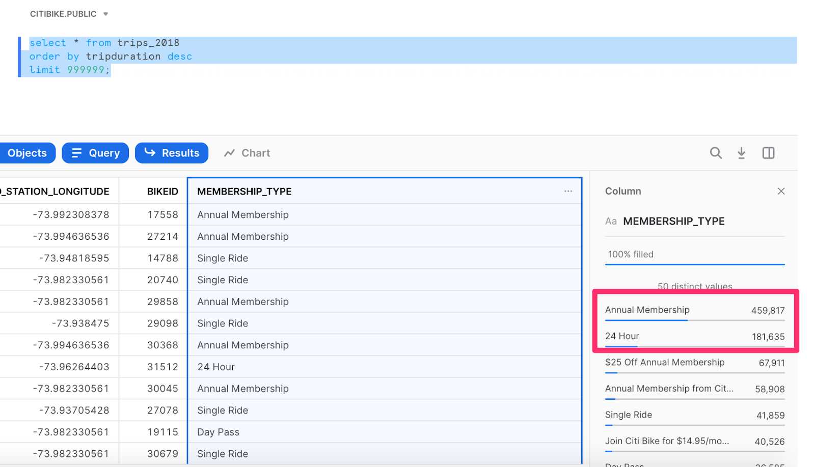
Are you interested in learning more about the type of membership for these trips? Those statistics are right at your fingertips! In fact, it shows that almost half of the riders have annual memberships, while the second-largest proportion has purchased just a 24-hour ride.
Now that you have this information, maybe you want to find out some more details about those specific riders who end at the Central Park South and 6 Avenue stations so you can figure out the best marketing campaign to target them. You might be wondering:
Do these riders have a smaller/larger proportion of annual memberships that might make them respond well to an annual discount?
Or, conversely,
Are these riders tourists?
If it’s the latter, it may make more sense to partner with other experiential companies to drive more traffic to these stations (no pun intended). Either way, we can use this question to form a new query and build a quick histogram to find out more details. For the new query, we’ll add a “where” filter using "end_station_name = 'Central Park S & 6 Ave'."
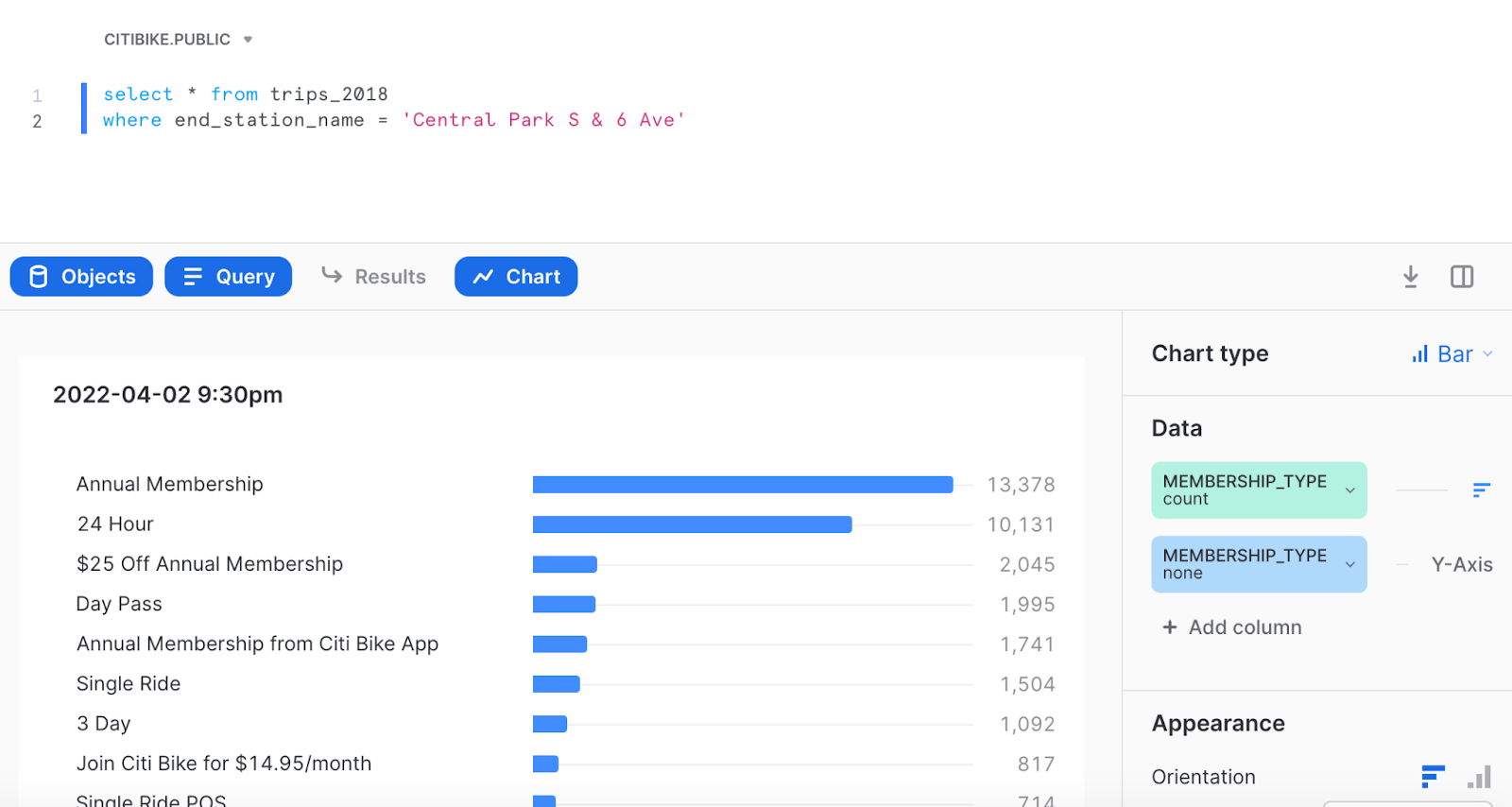
After running the query, the hypothesis that more tourists (or just first-time Citi Bikers) are using Citi Bike for a day seems fairly accurate. According to the chart, the gap between annual members and 24-hour customers is quite small, so an annual discount for a marketing campaign wouldn't pack a very powerful punch. 👊
If you’re considering other campaign options and you need other details (such as gender, seasonal patterns, or you want to combine multiple data sources), you can run a new query to get that information, too. Using Snowsight, you can determine the most effective approach to targeting these customers.
You can also use Snowsight to build these charts into a dashboard, then easily share them with your colleagues to tell a story or just to share some quick insights. 💡
Want to see how? Let's go! 🚲
Using Dashboards and Tiles to filter results
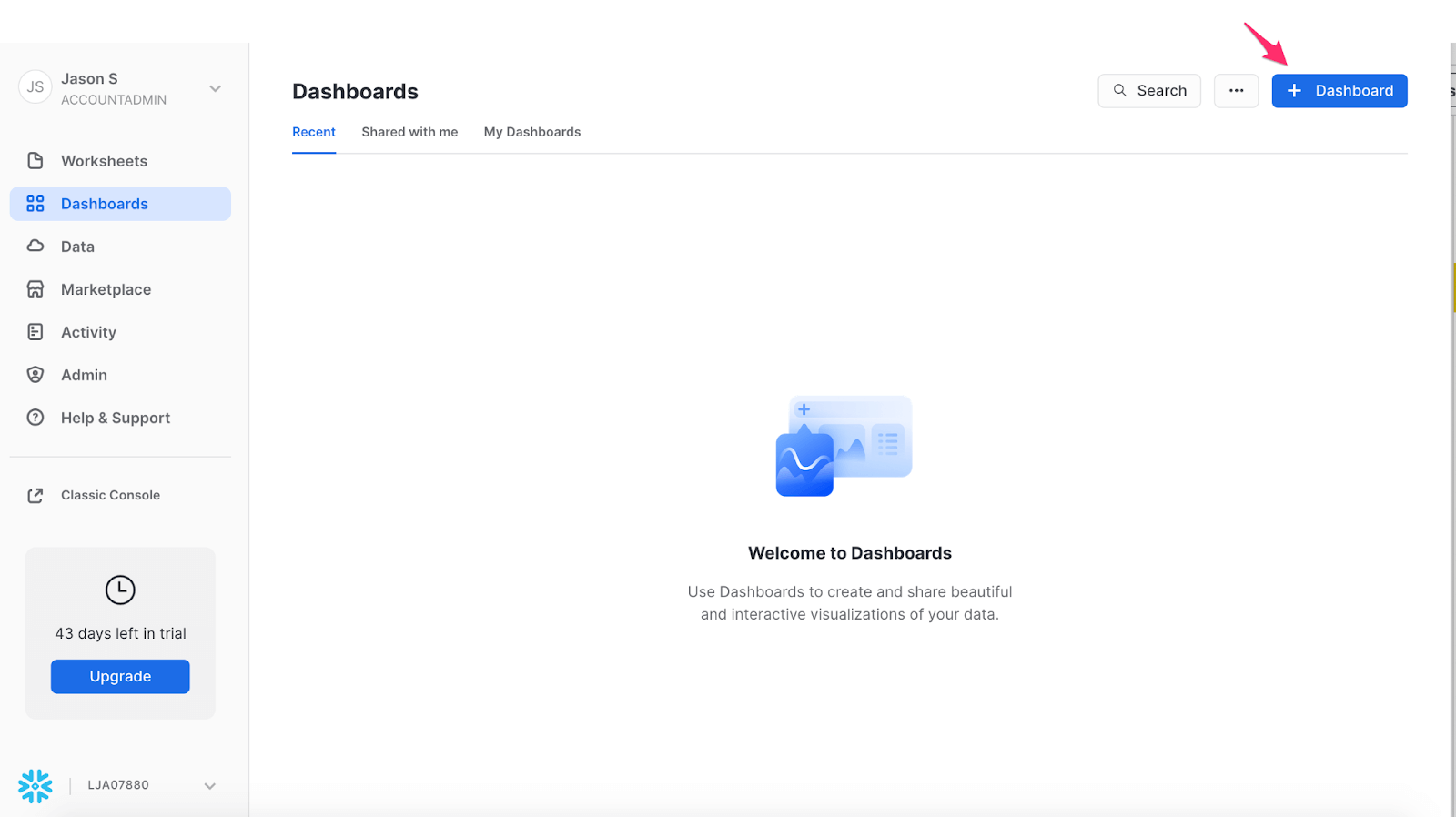
Using the information we analyzed in part one – the most common bike drop-off stations and the types of memberships – we'll create a new Dashboard by navigating to the Dashboards tab and clicking the blue Dashboard button, located at the top right of the window.
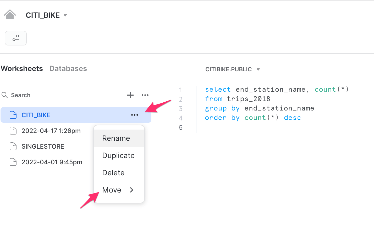
You can give the Dashboard any name you’d like and, from here, you can start adding Tiles. Tiles can either be newly added from the Dashboard itself, or they can be created from existing Worksheets. For this purpose, we’ll go into one of our existing Worksheets, click the 3 dots next to the worksheet name, and “Move” the Worksheet to the new Dashboard.
Of course, you can customize the look and feel of the query with your preferred chart types (whether that’s a histogram or just a results table). I decided on a bar chart, so now you can see the first building block of your Dashboard. 🏗️
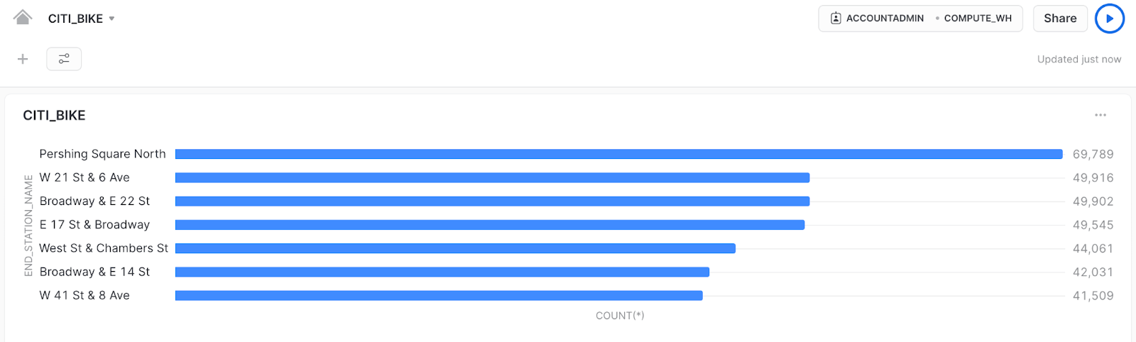
Remember, the data we’re looking at is for all Citi Bike trips in 2018. During that time, the most popular ending stations were in busy areas, so we can probably infer that these users are mainly commuters that are dropping their bikes off at the end of the day.
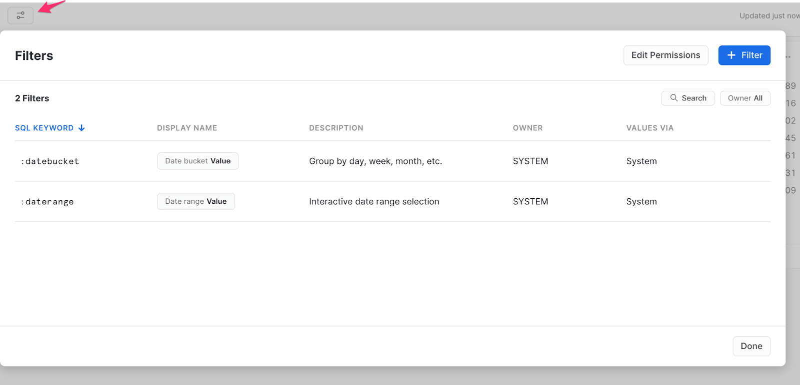
Now, here’s where the power of Snowsight really comes in – you can add filters to the Dashboard. These filters allow you to easily start exploring the data without running SQL queries or connecting an outside visualization tool. Snowsight has two out-of-the-box filters, “:datebucket” and “:daterange”, with more details on these available if you explore the filter icon on the top left of the Dashboard.
In this case, we don’t care about grouping the dates into buckets, so we’ll focus only on the :daterange filter. To enable the filter, add it in the “where” clause within the Tile query, as shown.
select end_station_name, count(*)
from trips_2018
where date_trunc('DAY',STOPTIME) = :daterange
group by end_station_name
order by count(*) descNow that you’ve added this filter, you’ll see a date range filter option on the top of the Dashboard, so you can drill further into data within your date ranges of interest. Let’s see if the warm weather causes any differences in end stations by setting the date range to look at only June. ☀️
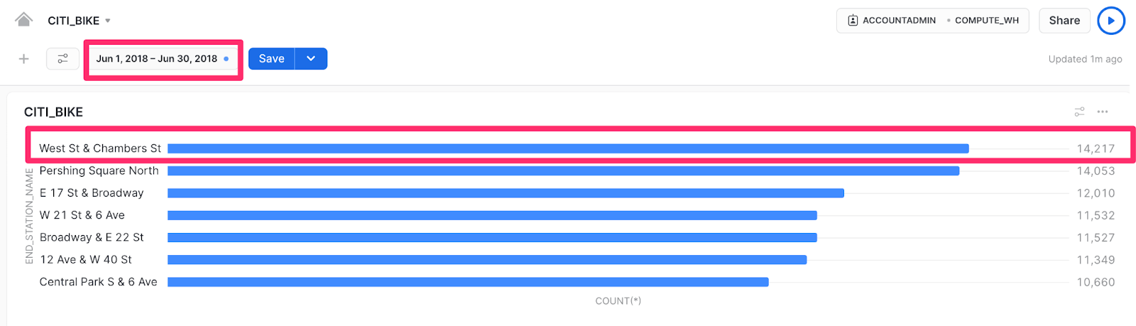
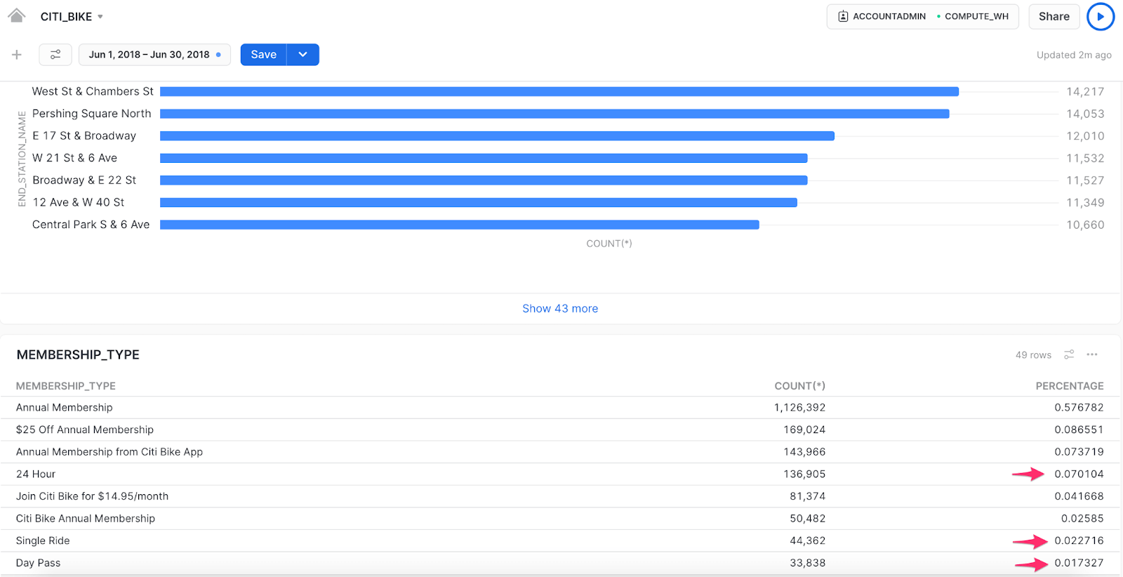
In June, there’s an interesting change in the data – the West St & Chambers St station moves to the top of the list, whereas before it was only the 5th most popular end station. This location is located near the Hudson River walkway and popular parks which could be an attraction for non-regular riders (like tourists) to take day trips. Let’s pull some additional data into the Dashboard to confirm, though, before coming to any marketing campaign conclusions.
We’ll add a new Tile to the Dashboard that groups the trips by membership_type and counts each type alongside a displayed percentage. When we apply this Tile, the June membership data shows that only about 10% of trips were day trips.
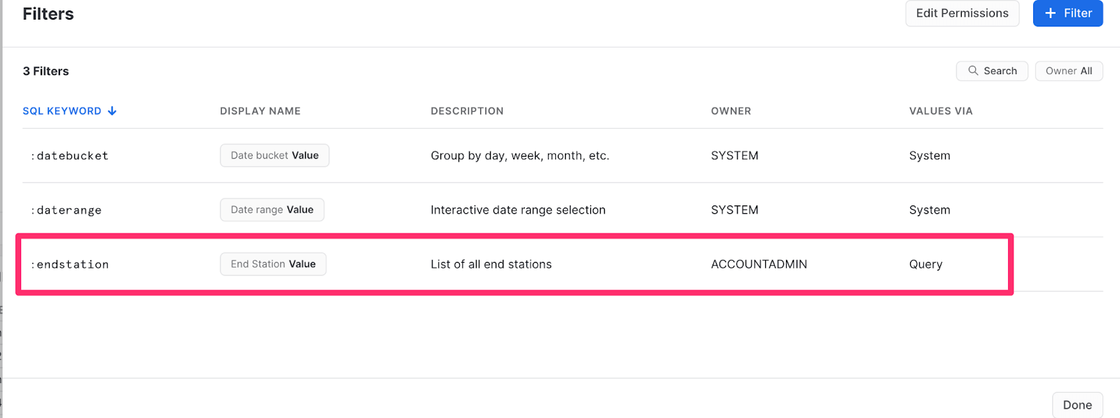
Snowsight also allows you to add your own filters to the Dashboard. I’ll add a filter for “end station”, so I can look more closely at particular stations. 🔍
To add a new filter, you’ll simply click the Filter button on the Dashboard again, but for a custom filter, you can use a SQL query or a predefined list. Since we’re doing a custom filter, I’ll use a query to find the distinct station names and order them alphabetically for ease of use. It looks something like this:
select distinct end_station_name
from trips_2018
order by end_station_name asc
Voila! Now you should see a new custom filter for end stations.
To see the filter appear on the Dashboard, add it to the most recently added Tile query in the “where” clause, as we did with the previous :daterange filter.
select membership_type, count(*), ratio_to_report(count(*)) over () as percentage
from trips_2018
where date_trunc('DAY',STOPTIME) = :daterange
and end_station_name = :endstation
group by membership_type
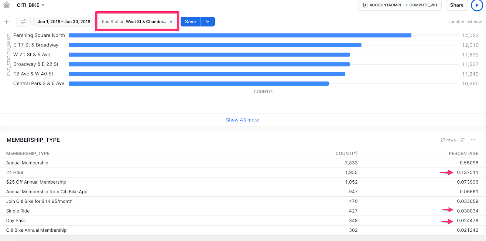
order by count(*) descThe End Station filter should be at the top of the Dashboard, near the date range filter, so you can look more closely at the West St & Chambers St data.
Becoming data-driven with Snowsight
After doing a deeper dive into the data, you can see that there are far more annual membership riders than day riders for this particular drop-off location at this time of year, so June could be a great opportunity to create a discounted annual membership marketing campaign. Armed with this data-backed approach, your marketing team may decide to add an annual membership discount flier at this station or target these particular riders within the app itself. Whatever the team chooses to do, you can all feel confident that you’re using a data-driven approach thanks to Snowsight.
Keep in mind, these are just a few, quick takeaways from the data! You can share your Dashboard with other data analysts on your team to find even more valuable insights. There are also tons of other use cases, so you can easily use your Snowflake account as a one-stop shop to analyze any past performance and make informed decisions about your datasets moving forward.
If you actually do work at Lyft (and even if you don’t) and want to send your data from Snowflake to Salesforce, Google Ads, or Braze to run personalized marketing campaigns at scale, get your free Census account and start syncing today!