


Often, folks perceive marketing as more of an art than a science. But with the emergence of online marketing and big data, marketing is more mathematical and methodical than ever. In fact, it represents one of the biggest areas of opportunities for data science and machine learning applications. 🤯
This article covers one of the many powerful applications of data science in marketing: Marketing mix modeling. Specifically, we’ll cover what it is, why it’s so useful, how to build it in Python, and most importantly, how to interpret it.
What is a marketing mix model?
A marketing mix model is a modeling technique used to determine market attribution, the estimated impact of each marketing channel company uses.
Unlike attribution modeling, another technique used for marketing attribution, marketing mix models measure the approximate impact of your marketing channels, like TV, radio, and newspapers.
Generally, your output variable will be sales or conversions, but it can also be things like website traffic. Your input variables typically consist of marketing spend by channel by period (day, week, month, quarter, etc…), but can also include other variables, which we’ll get to later.
The usefulness of marketing mix models in Python
You can tap into the power of a marketing mix model in a number of ways, including:
- To get a better understanding of the relationships between your marketing channels and your target metric (i.e. conversions).
- To distinguish high ROI marketing channels from low ones and ultimately better optimize your marketing budget.
- To predict future conversions based on given inputs.
Each of these insights can offer a ton of value as you scale your business. Let’s dive into what it takes to build one with Python. 👀
How to build a marketing mix model in 4 steps
To help you get a better feel for marketing mix models, this section will walk you through building a marketing mix model in Python from scratch. We'll use a dataset from Kaggle for our example.
Step 1: Import all relevant libraries and data.
First, import all relevant libraries to build the model, as well as the data itself by reading the CSV file.
import numpy as np
import pandas as pd
import seaborn as sns
import matplotlib.pyplot as plt
df = pd.read_csv("../input/advertising.csv/Advertising.csv")
Step 2: Perform some exploratory data analysis
Generally, you’d conduct a lot more exploratory data analyses, but for this tutorial, we’ll focus on the three most common (and powerful, in my experience):
- Correlation matrices: a table that shows the correlation values for each pair-relationship
- Pair plots: a simple way to visualize the relationships between each variable
- Feature importance: techniques that assign a score for each feature based on how useful they are at predicting the target variable
1. Correlation matrix
To reiterate, a correlation matrix is a table that shows the correlation values for each pair relationship. It’s a very fast and efficient way of understanding feature relationships. Here's the code for our matrix.
corr = df.corr()
sns.heatmap(corr, xticklabels = corr.columns, yticklabels = corr.columns, annot = True, cmap = sns.diverging_palette(220, 20, as_cmap=True))
The code above first calculates the correlation values for each pair relationship and then plots it on a heatmap.
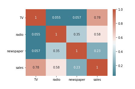
The correlation matrix above shows that there’s a strong correlation between TV and sales (0.78), a moderate correlation between radio and sales (0.58), and a weak correlation between newspaper and sales (0.23). It’s still too early to conclude anything but this is good to keep in mind as we move on with other EDAs.
2. Pair plot
A pair plot is a simple way to visualize the relationships between each variable - it’s similar to a correlation matrix except it shows a graph for each pair-relationship instead of a correlation. Now let’s take a look at the code for our pair plot, as well as the result.
sns.pairplot(df)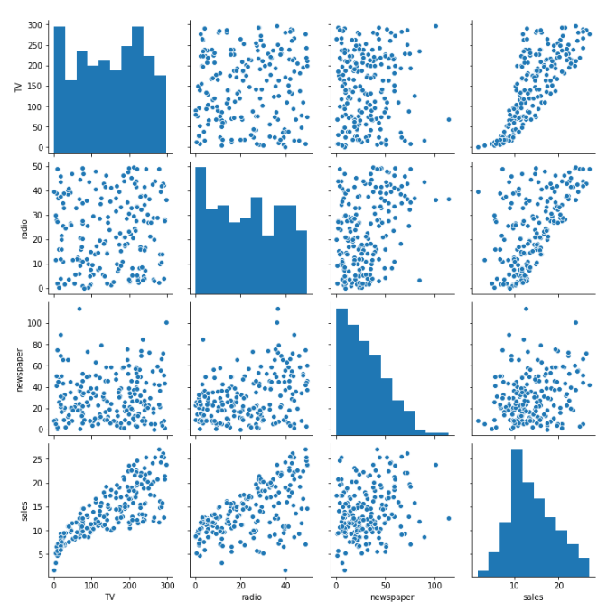
We can see some consistency between our pair plot and our original correlation matrix. It looks like there’s a strong positive relationship between TV and sales, less for radio, and even less for newspapers.
3. Feature importance
Feature importance allows you to determine how (you guessed it) “important” each input variable in predicting the output variable. A feature is important if shuffling its values increases model error because this means the model relied on the feature for the prediction.
# Setting X and y variables
X = df.loc[:, df.columns != 'sales']
y = df['sales']# Building Random Forest model
from sklearn.ensemble import RandomForestRegressor
from sklearn.model_selection import train_test_split
from sklearn.metrics import mean_absolute_error as mae
X_train, X_test, y_train, y_test = train_test_split(X, y, test_size=.25, random_state=0)
model = RandomForestRegressor(random_state=1)
model.fit(X_train, y_train)
pred = model.predict(X_test)# Visualizing Feature Importance
feat_importances = pd.Series(model.feature_importances_, index=X.columns)
feat_importances.nlargest(25).plot(kind='barh',figsize=(10,10))
The code above first creates a random forest model with sales as the target variable and the marketing channels as the feature inputs. Once we create the model, we then calculate the feature importance of each predictor and plot it on a bar chart.
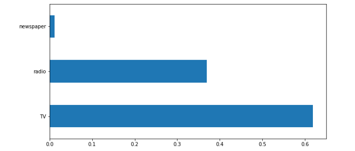
We can see a pattern: TV is the most important, followed by radio, leaving newspapers last. Now that we know our EDAs consistently return the same results, we can move on to actually building our model.
Step 3: Build the marketing mix model
It’s time to build our marketing mix model! 🎉 Another way to refer to the model we’re building is an OLS model, short for ordinary least squares, which is a method used to estimate the parameters in a linear regression model. An OLS model is a type of regression model that's most commonly used when building marketing mix models. What makes Python so amazing is that it already has a library that you can use to create an OLS model:
import statsmodels.formula.api as sm
model = sm.ols(formula="sales~TV+radio+newspaper", data=df).fit()
print(model.summary())
The code above creates our ordinary least squares regression model, which specifies that we’re predicting sales based on TV, radio, and newspaper marketing dollars.
Step 4: Plot actual vs predicted values
Next, let’s graph the predicted sales values with the actual sales values to visually see how our model performs. You'd want to do this in a business use case if you’re trying to see how well your model reflects what’s actually happening - in this case, if you’re trying to see how well your model predicts sales based on the amount spent in each marketing channel.
from matplotlib.pyplot import figure

y_pred = model.predict()
labels = df['sales']
df_temp = pd.DataFrame({'Actual': labels, 'Predicted':y_pred})
df_temp.head()

figure(num=None, figsize=(15, 6), dpi=80, facecolor='w', edgecolor='k')
y1 = df_temp['Actual']
y2 = df_temp['Predicted']plt.plot(y1, label = 'Actual')
plt.plot(y2, label = 'Predicted')
plt.legend()
plt.show()
The code above creates a plot of the predicted values against the actual values, which can be seen below:
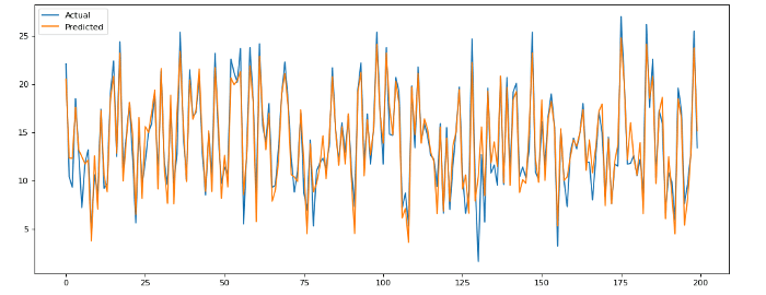
Not bad! It seems like this model does a good job of predicting sales given TV, radio, and newspaper spend.
How to interpret a marketing mix model
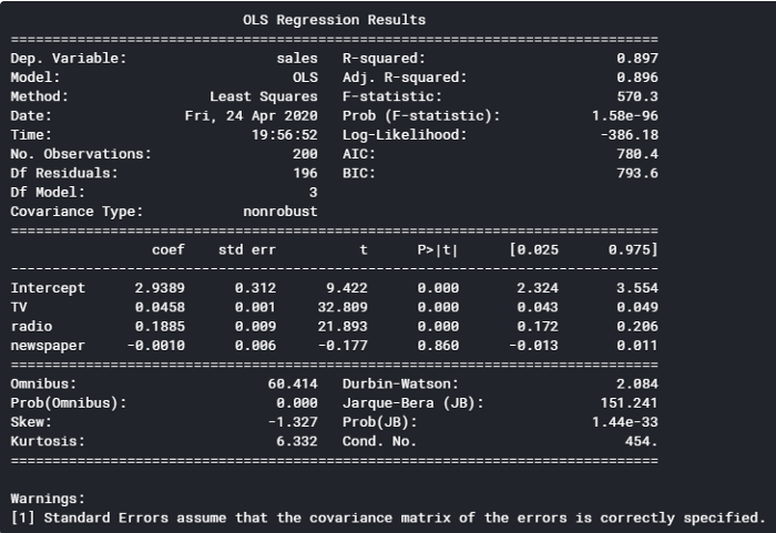
.summary() provides us with an abundance of insights on our model. Going back to the output from .summary(), we can see a few areas to focus on (you can reference these insights against the OLS regression results below):
- The Adj. R-squared is 0.896. This means approximately 90% of the total variation in the data can be explained by the model. This also means the model doesn’t account for 10% of the data used — this could be due to missing variables, if, for example, there was another marketing channel that wasn’t included, or simply due to noise in the data.
- At the top half, you can see Prob (F-statistic): 1.58e-96. This probability value (p-value) represents the likelihood that there are no good predictors of the target variable — in this case, there are no good predictors of sales. Since the p-value is close to zero, we know that there is at least one predictor in the model that is a good predictor of sales.
- If you look at the column, P>|t|, you can see the p-values for each predictor. The p-values for TV and radio are less than 0.000, but the p-value for newspapers is 0.86, which indicates that newspaper spend has no significant impact on sales. Generally, you want the p-value to be less than 1% or 5%, which are the two standards in practice.
You can see from the three insights above how useful a marketing mix model is in helping you dive deeper into your data to improve sales. You should now be able to harness the core concepts of this modeling technique to level up your analysis.
If you’re looking for more ways to improve your data skills, check out our other tutorials here. Or, if you have questions (or want us to help you build your marketing mix model), drop us a line.